National Geographic, Leonardo Da Vinci and SpyderCHECKR: do they have something in common? And why?
Well, if it happens to photograph for the famous magazine a painting possibly made by Leonardo called “La Bella Principessa”, and accurate colors are required, the three will definitely combine together!
The multitalented personality of Leonardo Da Vinci always fascinated me and I’ve always been a huge fan of him. Famous for his paintings and inventions, he was also an incredible musician, anatomist, mathematician, geologist, cartographer and botanist, among others. Imagine my excitement when I received a call from National Geographic about a possible Da Vinci painting they wanted me to photograph!
Introduced to the art world at a Christie’s auction in New York City in the late ‘90s, and later purchased by a canadian art collector, this colored chalk-and- ink drawing on vellum seems now to have many common characteristics with the unique Leonardo painting technique, and the National Geographic story would be about showing what are the possible common points.
National Geographic already had a layout in mind, so I had to make images following some directions. This didn’t make the assignment any less appealing, it just made it more difficult. Among others, I had to make a picture on a black background of two hands with white gloves holding La Bella Principessa (the painting’s name) showing the signs of time on the paint.
If it doesn’t sound tricky exposed like that, when you get on the location and you discover there are almost 8 stops of difference between the painting and the hands with white gloves, I definitely needed to find a good solution! (it would have been so nice -and easy- if the gloves had been another color… anything but white!) Plus, the painting (originally part of an ancient handmade book) was glued on a wooden tablet, so as well as being dark, it was glossy. Not exactly the easiest subject to illuminate… but the shooting went well and the photographs I took eventually made the cover of several international editions of National Geographic.
Now, this is where it becomes interesting: some of you might know that National Geographic Magazine generally prefers to develop all raw files in house. This is mainly to avoid artificial manipulations and make sure pictures get published exactly as taken. The procedure is quite simple, you just take the pictures and then you send EVERYTHING you shot to them, end of story. Even if you accidentally take a picture of your hand or your foot, just send it! No processing, no editing, no developing… sounds easy. And so it did to me. I thought the shooting (and the difficulties) were over… but I was wrong!
A few days after sending all the images, I received another call from NG, asking me to process the files for them. Why was that? Not being on location with me, they had no clue about the real colors of the painting, so they wanted me to take care of that aspect.
This is the typical scenario where I bless the SpyderCHECKR and the fact that I had mine with me (if I am shooting scenarios with rapidly changing shooting conditions like reportage, I do not carry it in my bag). Even without knowing that I would have been responsable for color correcting the images for National Geographic, I shot several reference images with the SpyderCHECKR in the frame with the same light that I used to photograph the painting.
I also experimented with different lights and settings, and for each situation I took a picture of the SpyderCHECKR. In picture A you see one of the pictures published in the magazine, and in picture B is my safety (color) guide, shot exactly with the same light. I simply replaced the painting with SpyderCHECKR (and yes, once done with the shooting in my photo bag I packed away the SpyderCHECKR and not the painting…)
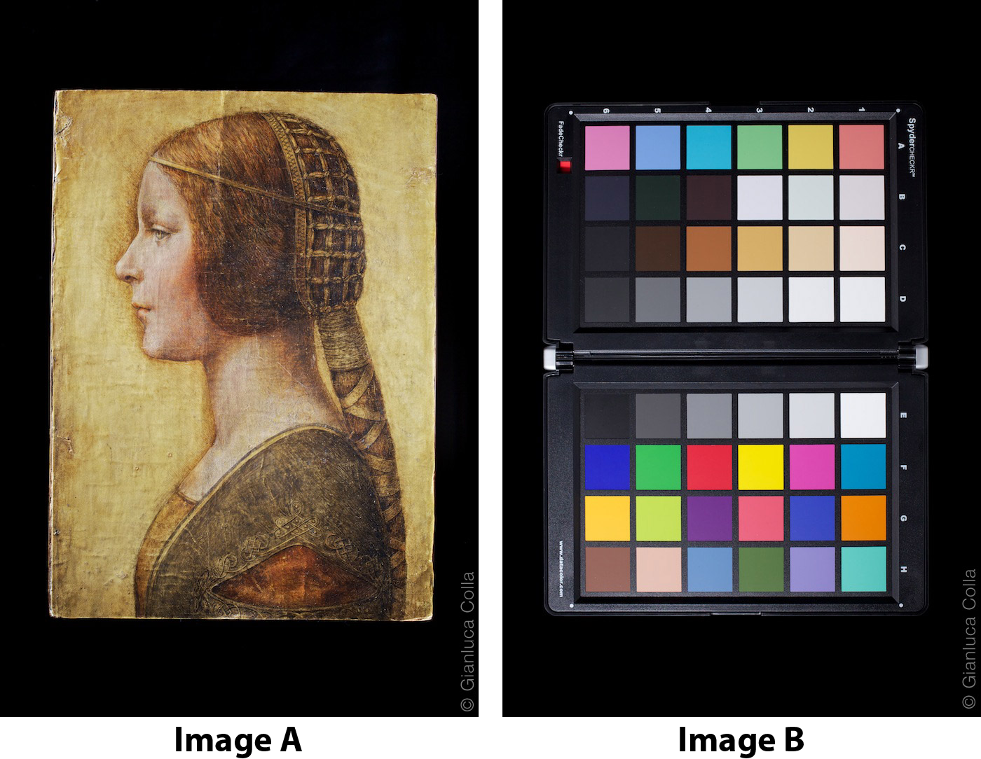
What a good idea! If I hadn’t done this, I would have had no clue what the true colors where when NGS asked me to process the files.
Not only did I had proper references to “calibrate” the colors, but I could immediately deliver processed Hi-Res images with the confidence that 40 million readers would see the true colors of La Bella Principessa.
